Streamlining Expense Management
Enhancing the User Experience for Submitting Expenses

Company overivew
Workday is a cloud-based software company providing enterprise solutions for financial management, human resources, and planning. Its platform seamlessly integrates HR and financial functions. As the lead designer for the Expenses tool, I updated the experience based on research and feedback from our customers, allowing users to effortlessly submit and approve expenses from both desktop and mobile platforms.
Deliverables
Focused on designing responsive web interfaces and mobile apps.
Role
Lead designer and research.
Objective
Our goal was to enhance the quality of the user experience in the Expenses tool and align its functionality more closely with customer needs. We focused on two key areas that drove our design explorations:
- Expensing Meals or Drinks
- Hotel Expenses
Outcome
Through collaborative design workshops and wireframe development, we created a shared vision for the new Expenses tool. By comparing the current design with the new one, we proved that the updated design outperforms the old one. User testing confirmed that users prefer the new design, showcasing its improved usability and effectiveness.
Research
We conducted two user research sessions during the design process to gather diverse feedback. Our focus was on two key areas that guided our design explorations.

Expensing Meals and Drinks

Hotel Expenses
Challenges
We received strong feedback from both customers and the sales team about the limitations and issues with the current Expenses experience, which we used to drive improvements.

Exploring User Needs and Pain Points
To understand user needs in the expenses space, I began by leveraging my own experience with the current product and attending customer calls. Since Workday uses its own product, I also reached out via the Slack channel dedicated to travel-related questions. I actively connected with Workday users interested in providing feedback on the new features we were developing. This effort resulted in engaging over 50 users, who were eager to share their insights, helping us gain a deeper understanding of our users.
“I travel for work and I need to be structured and organized for all expenses. If there’s a product that can be submitted for me, I don’t have to worry about a deadline.”
Helped to lead design workshop
As this was a new team working across two different time zones, we needed to connect and determine the future direction for the expenses space. I co-organized a two-day design workshop with product managers, designers, and development leads. We utilized Jobs-to-Be-Done (JTBD) brainstorming sessions, followed by How Might We (HMW) questions to turn user pain points into opportunities for innovation. We then moved into ideation sessions, including Crazy 8's, where we rapidly explored diverse solutions, and concluded with storyboards that illustrated the benefits and use cases of our ideas.
This reframing sparked creative ideation sessions, generating diverse solutions focused on improving the user experience.

Iterating in Lo-fi
I want to ensure we capture all the different flows to cover all the main use cases. Additionally, we had various assumptions about how users expect to see different information, so I designed two flows with some modifications.
Layout 1 - By Date Order
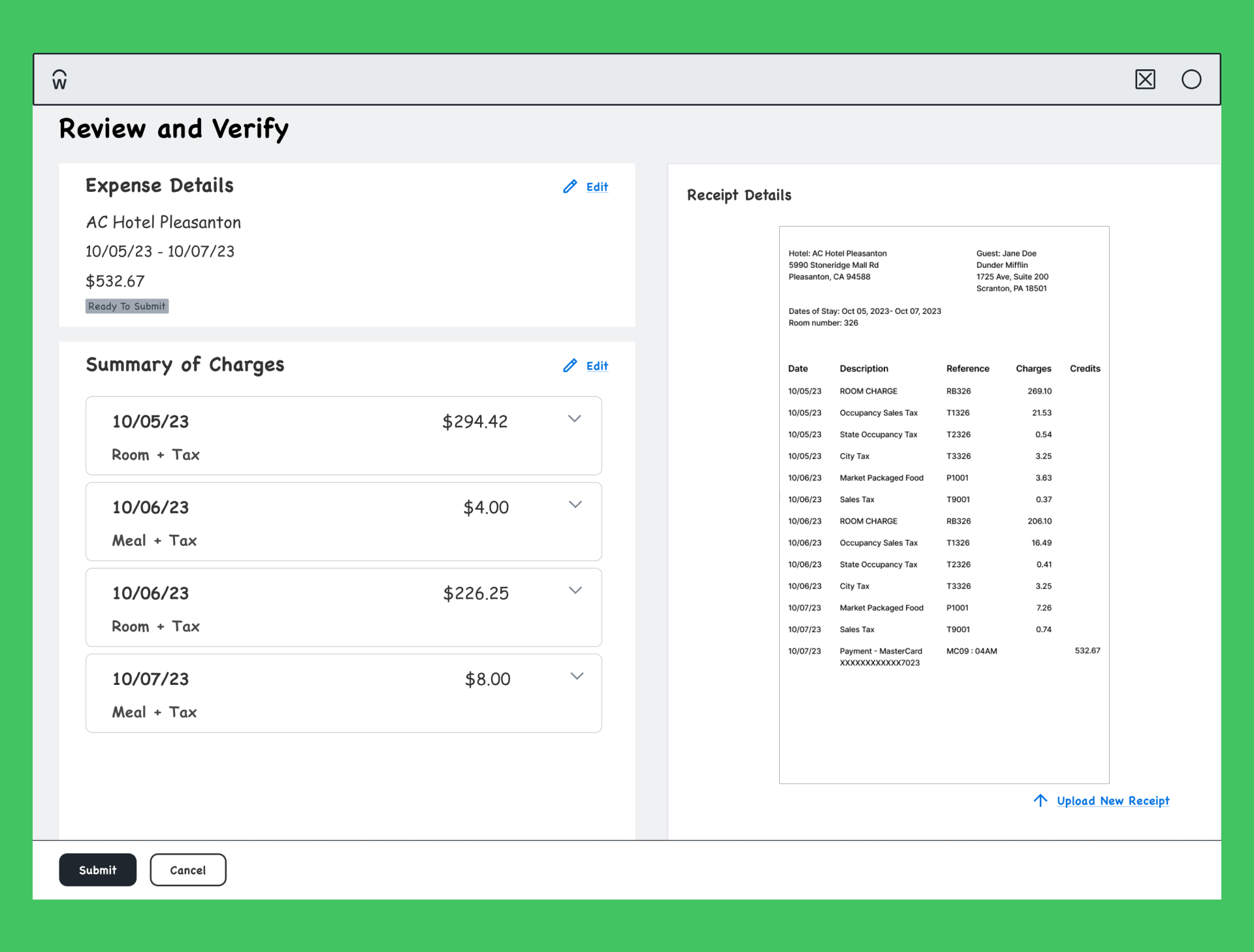
Layout 2 - By expense type
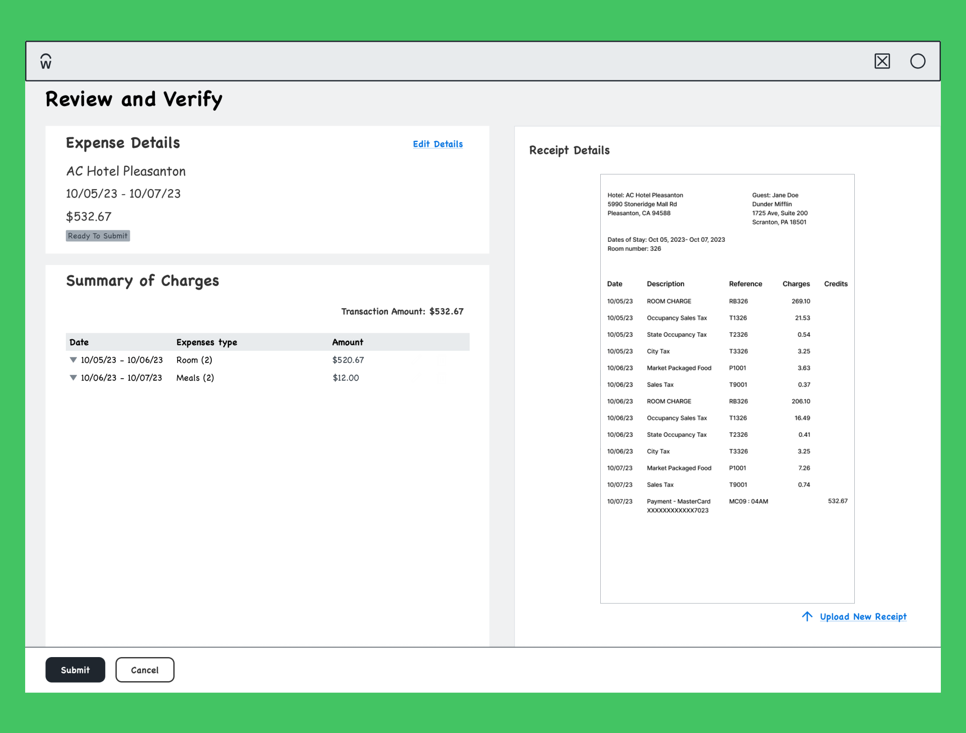
For each flow, I worked on detailing each use case: the happy path for submitting expenses, the unhappy path where the user has to input expenses from scratch, and the partial path where the user might need to input only part of the expense.
Layout 1: Expenses organized by date.

Layout 1: Ability to edit charges.
Layout 2: Organized by expense type, which can be further broken down into room or meal charges.
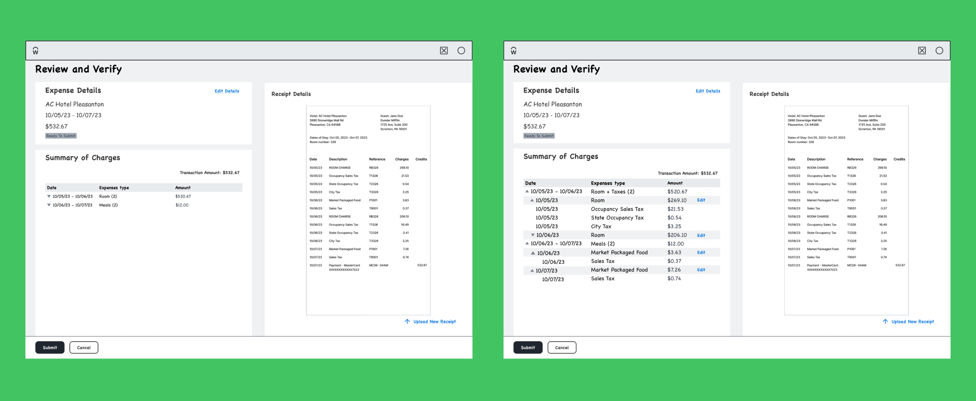
Layout 2: Edit charge details and expense information.

While working on this I was also helping on the mobile side of this project.
Happy Path: User just has to review the expenses.
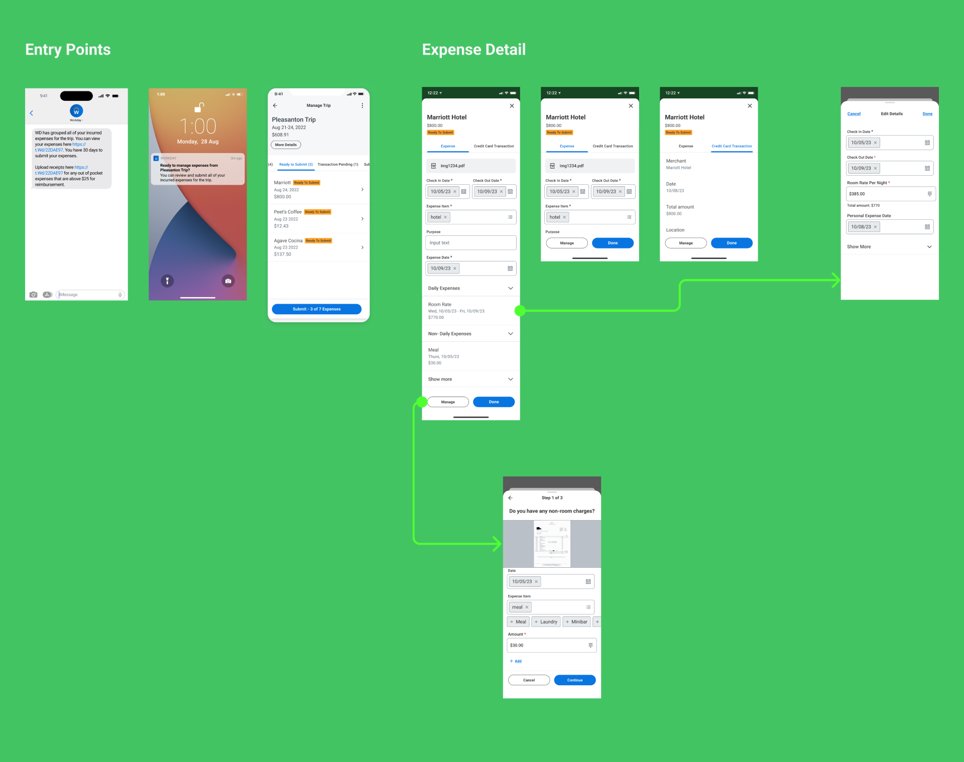
Unhappy Path: The user has to input expense information into the system.
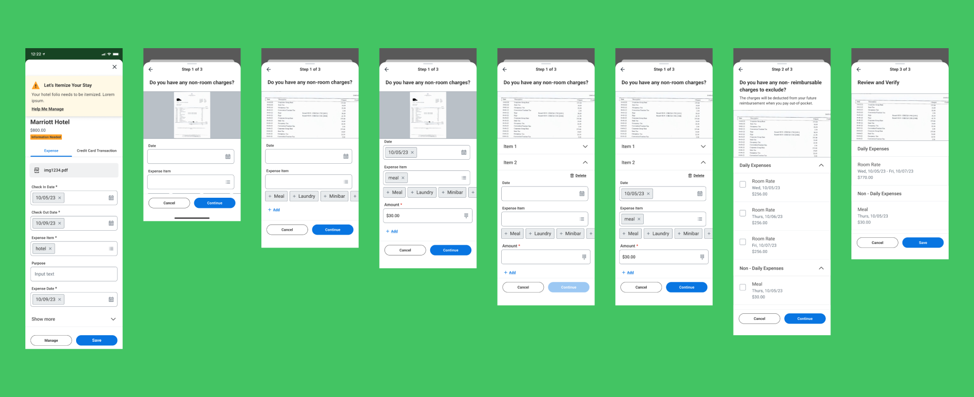
Prototyping and User Testing
I turned the various layouts and use cases into prototypes. Using our dedicated user groups, my fellow designer and I planned and wrote a script to test with 8 users, and we shared key insights with our product managers and lead engineers.
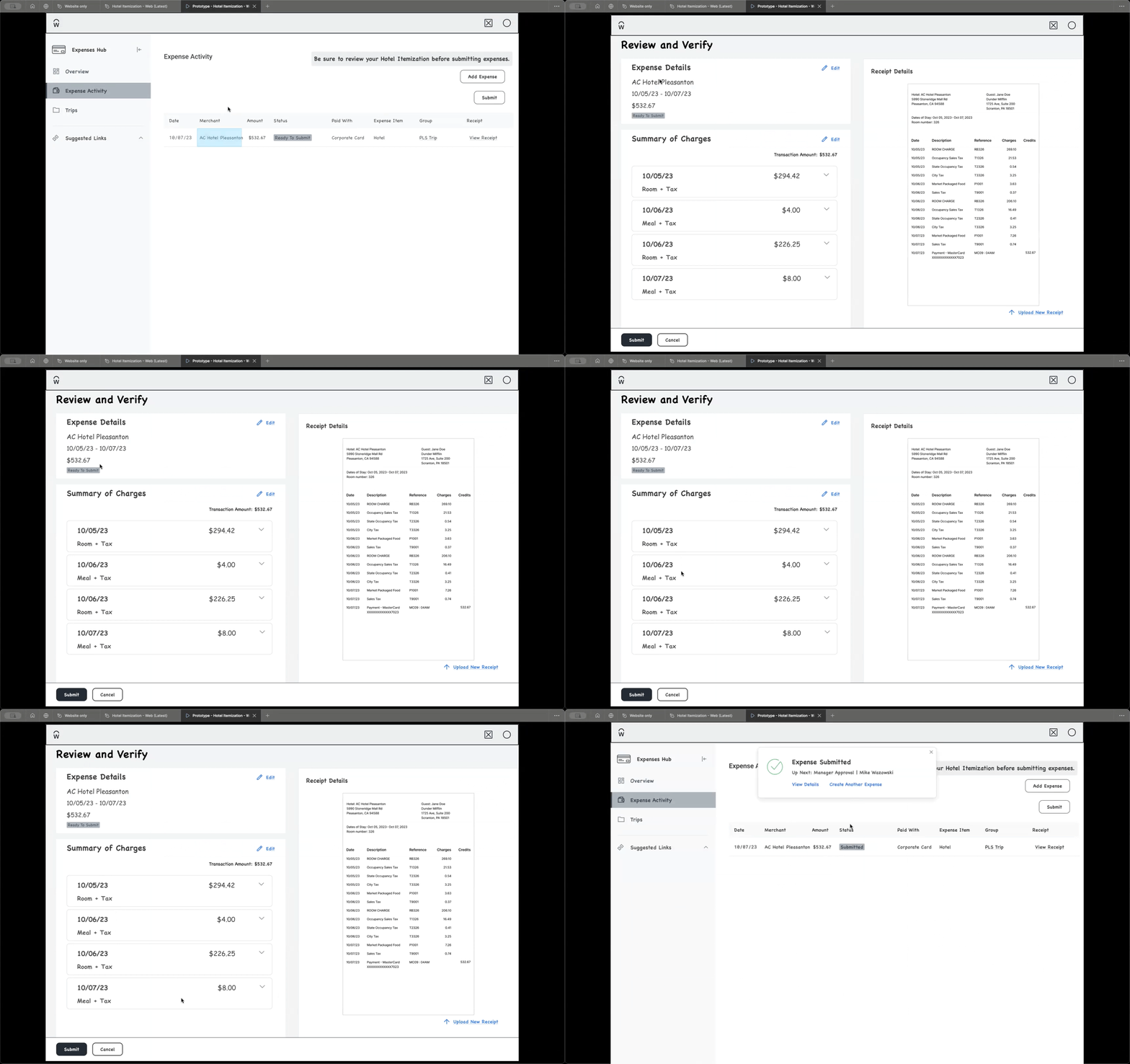
Happy path
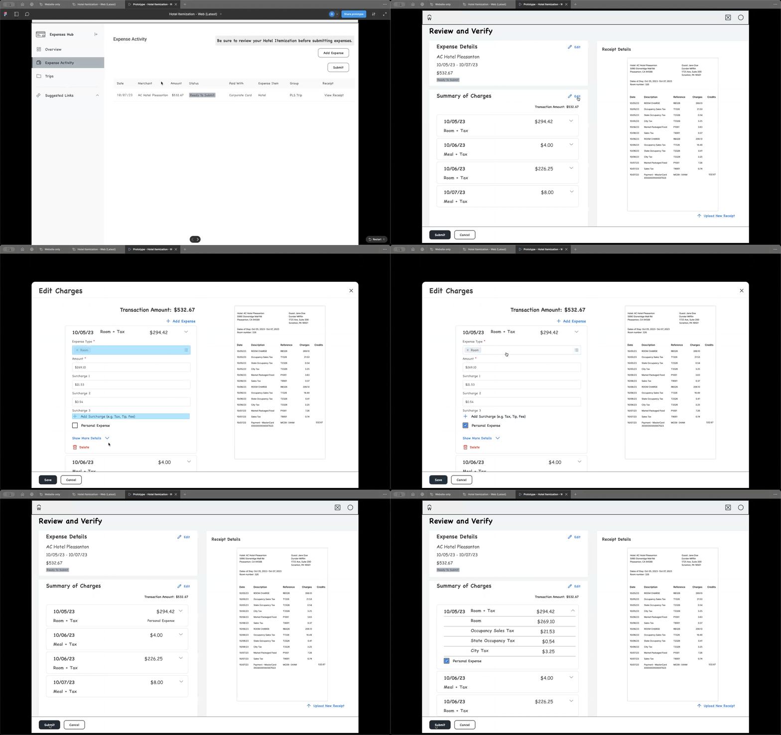
Edit charges
Findings
Collected valuable feedback and shared insights with product managers and engineers to align on immediate priorities and identify areas to address later.
Review layout preference
The redesign was considered an improvement over the current production release by all participants.
Layout preference
6 of 8 participants liked layout 1 vs layout 2
Layout 1: Chronological listing of items matches their mental model.
Layout 2: Expense type grouping is preferred for longer hotel folios.
Final design proposal
After several iterations and additional feedback, we decided to proceed with the updated design, which addressed most of the feedback we received.
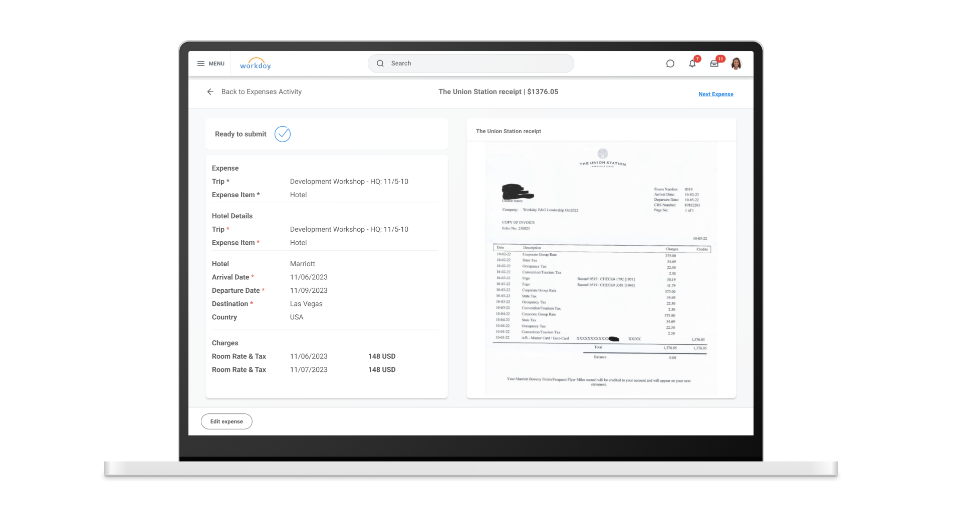
Impact
We met with our key customers on a recurring basis and collected positive feedback on the new design. We achieved the Expenses team’s OKR goal and met our UX goal of conducting three research sessions throughout the project.
Thanks for reading.
If you’re curious tom see more, check out the additional case studies below.